DBSA: SF Chapter
DBSA: SF Chapter
DBSA: SF Chapter
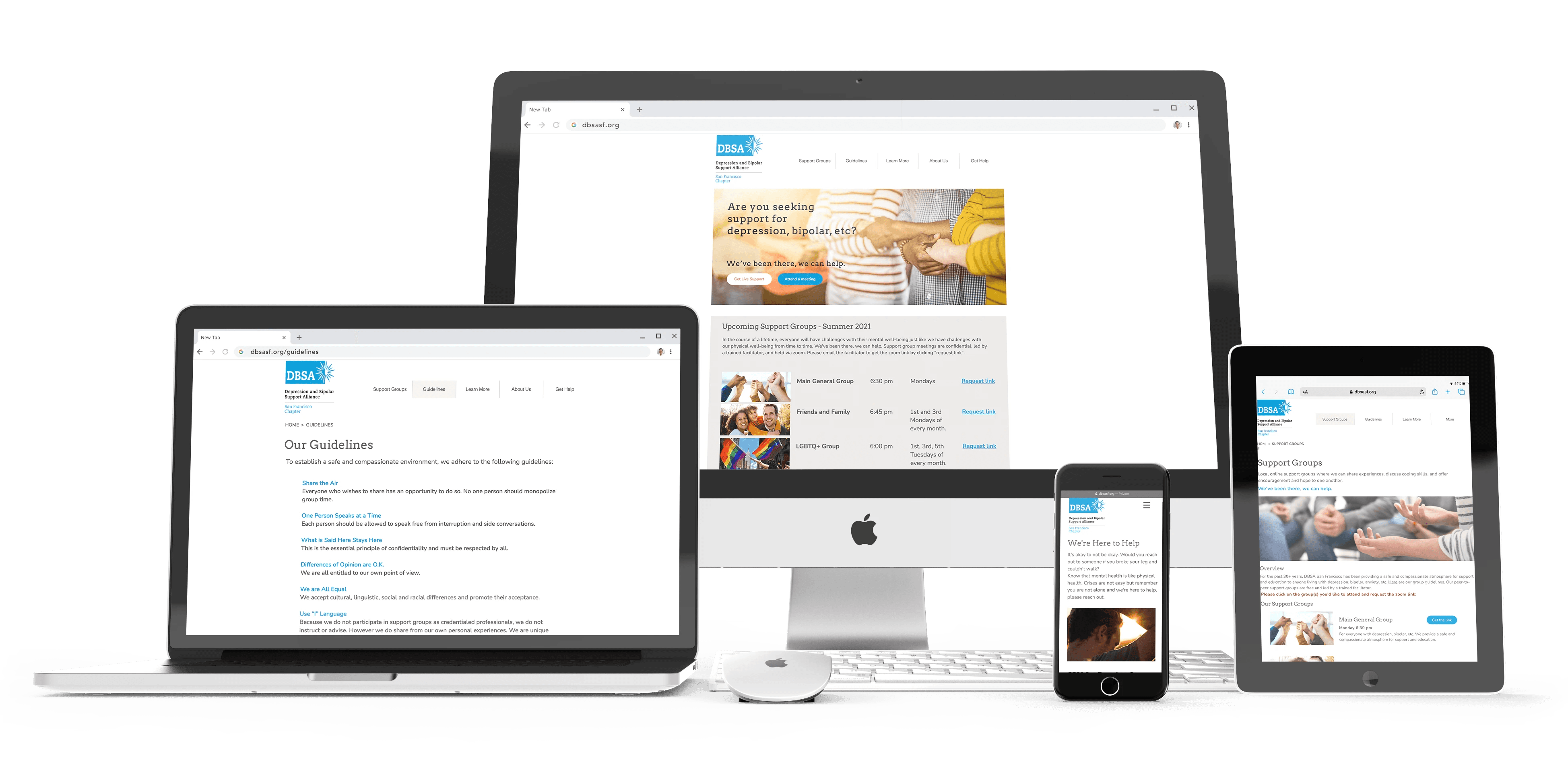
Helped redesign the website for DBSA San Francisco. An organization that offers peer support, depression and bipolar disorder information & wellness tools. www.dbsasf.org
Helped redesign the website for DBSA San Francisco. An organization that offers peer support, depression and bipolar disorder information & wellness tools. www.dbsasf.org
Helped redesign the website for DBSA San Francisco. An organization that offers peer support, depression and bipolar disorder information & wellness tools. www.dbsasf.org


Role
Role
Role
Visual Design | UX Research
Team
Team
Team
Beatriz Barillas Anne Tsuei Michelle Guo Howard Pham Gabi Cardoso
Year
Year
Year
2021
Brief
Brief
Brief
DBSA San Francisco, a local Bay Area chapter, provides peer support, information on depression and bipolar disorder, as well as integrated wellness tools. In response to the COVID-19 pandemic, they transitioned most of their in-person resources, including meetings, to online (Zoom) to meet the growing demand for accessible mental and behavioral health care.
DBSA San Francisco, a local Bay Area chapter, provides peer support, information on depression and bipolar disorder, as well as integrated wellness tools. In response to the COVID-19 pandemic, they transitioned most of their in-person resources, including meetings, to online (Zoom) to meet the growing demand for accessible mental and behavioral health care.
DBSA San Francisco, a local Bay Area chapter, provides peer support, information on depression and bipolar disorder, as well as integrated wellness tools. In response to the COVID-19 pandemic, they transitioned most of their in-person resources, including meetings, to online (Zoom) to meet the growing demand for accessible mental and behavioral health care.
Problem
Problem
Problem
Users are having a difficult time navigating and finding clear & relevant information. How might our team improve the website to better support the community and make it more accessible when users are looking for help or access to support groups?
Users are having a difficult time navigating and finding clear & relevant information. How might our team improve the website to better support the community and make it more accessible when users are looking for help or access to support groups?
Users are having a difficult time navigating and finding clear & relevant information. How might our team improve the website to better support the community and make it more accessible when users are looking for help or access to support groups?
Solution
Solution
Solution
Chat with the stakeholders to figure out the best way to help their users find info and sign up for Support Groups easily. Their main goal here is to make sure that anyone who visits the site can quickly hop into a Zoom meeting. So, the homepage is the main spot where people can join Support Groups online. Give the website a redesign to make it more user-friendly and match the main organization's branding.
Chat with the stakeholders to figure out the best way to help their users find info and sign up for Support Groups easily. Their main goal here is to make sure that anyone who visits the site can quickly hop into a Zoom meeting. So, the homepage is the main spot where people can join Support Groups online. Give the website a redesign to make it more user-friendly and match the main organization's branding.
Chat with the stakeholders to figure out the best way to help their users find info and sign up for Support Groups easily. Their main goal here is to make sure that anyone who visits the site can quickly hop into a Zoom meeting. So, the homepage is the main spot where people can join Support Groups online. Give the website a redesign to make it more user-friendly and match the main organization's branding.
Analysis & Ideation
Analysis & Ideation
Analysis & Ideation
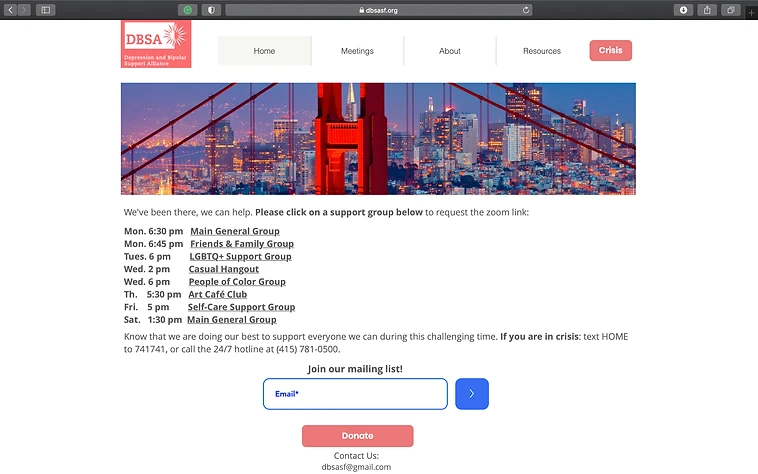
When taking on this project, the website looked uninviting and cold. So the team performed a site analysis to make the observations on the following: Accessibility, Branding, Content Relevance, First Impressions and Info Architecture
When taking on this project, the website looked uninviting and cold. So the team performed a site analysis to make the observations on the following: Accessibility, Branding, Content Relevance, First Impressions and Info Architecture
When taking on this project, the website looked uninviting and cold. So the team performed a site analysis to make the observations on the following: Accessibility, Branding, Content Relevance, First Impressions and Info Architecture


Concept Development
Concept Development
Concept Development
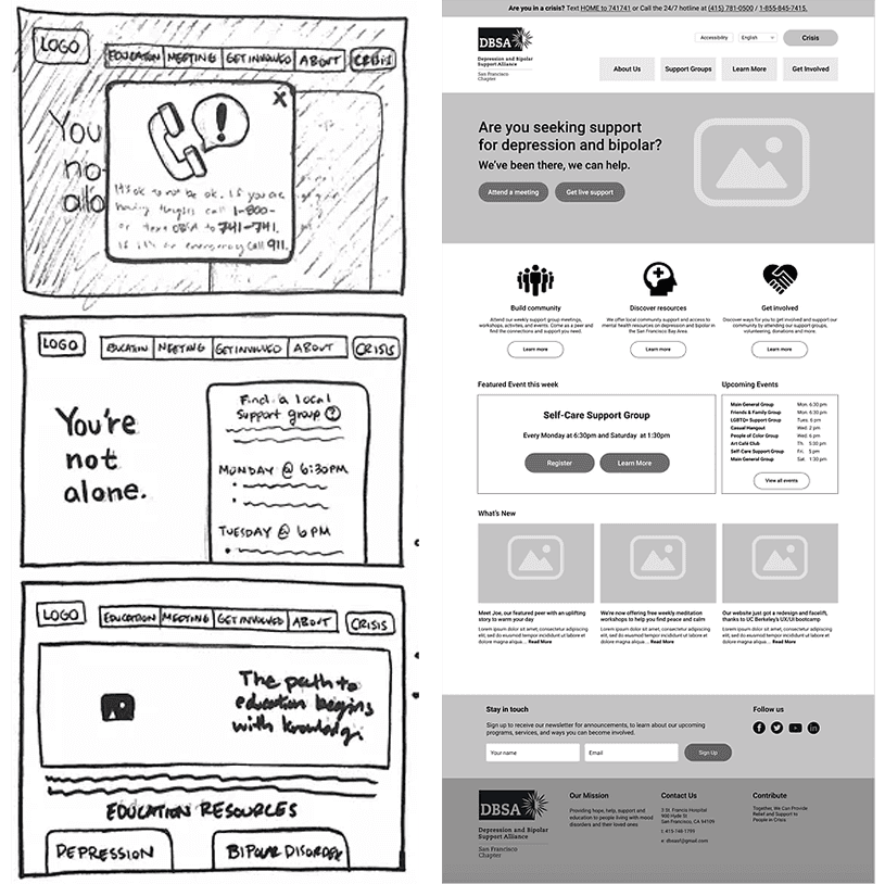
After the analysis, the team created paper sketches and a lo-fi version of the website. Then proceeded to conduct an A/B test, to see which of the two homepages worked best. All 5 users chose Homepage B due to the clean design and because of how user-focused it was compared to Homepage A and also of the site's use of easy, relatable language.
After the analysis, the team created paper sketches and a lo-fi version of the website. Then proceeded to conduct an A/B test, to see which of the two homepages worked best. All 5 users chose Homepage B due to the clean design and because of how user-focused it was compared to Homepage A and also of the site's use of easy, relatable language.
After the analysis, the team created paper sketches and a lo-fi version of the website. Then proceeded to conduct an A/B test, to see which of the two homepages worked best. All 5 users chose Homepage B due to the clean design and because of how user-focused it was compared to Homepage A and also of the site's use of easy, relatable language.


Design
Design
Design
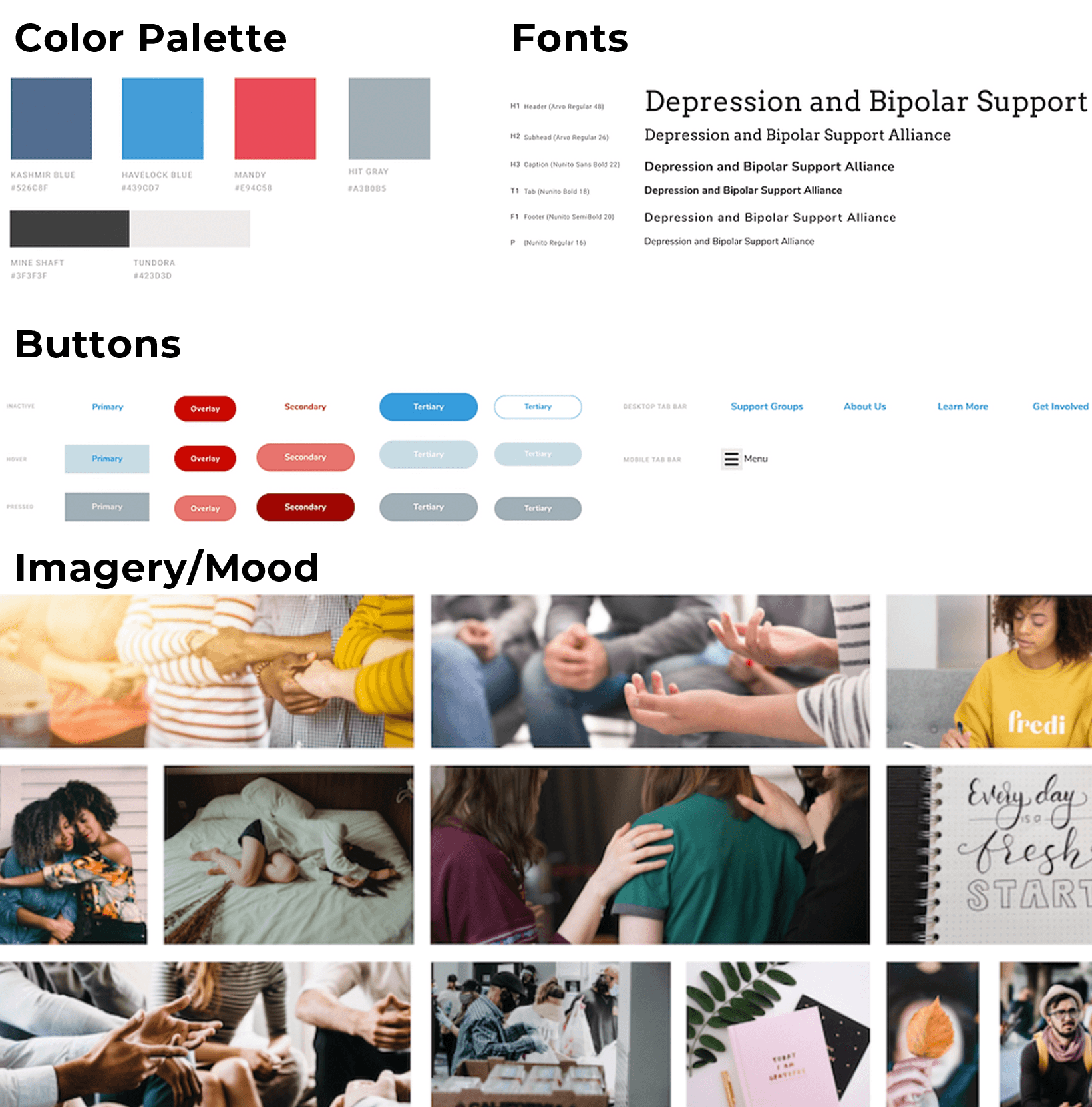
Wanting users to feel at ease the team followed the main organization's brand guidelines and stuck with the four main colors. The main blues were pulled from the main DBSA organization website and red was chosen to bring in warmth as well as an homage to the Golden Gate Bridge in SF.
Wanting users to feel at ease the team followed the main organization's brand guidelines and stuck with the four main colors. The main blues were pulled from the main DBSA organization website and red was chosen to bring in warmth as well as an homage to the Golden Gate Bridge in SF.
Wanting users to feel at ease the team followed the main organization's brand guidelines and stuck with the four main colors. The main blues were pulled from the main DBSA organization website and red was chosen to bring in warmth as well as an homage to the Golden Gate Bridge in SF.


Final Design/Prototype
Final Design/Prototype
Final Design/Prototype
Based on users' feedback, the overall stakeholder's goals, and after creating tons of iterations, this was the final product. Copy this link https://www.dbsasf.org/ to see the current website that closely follows the final prototype.
Based on users' feedback, the overall stakeholder's goals, and after creating tons of iterations, this was the final product. Copy this link https://www.dbsasf.org/ to see the current website that closely follows the final prototype.
Based on users' feedback, the overall stakeholder's goals, and after creating tons of iterations, this was the final product. Copy this link https://www.dbsasf.org/ to see the current website that closely follows the final prototype.
Reflection
Reflection
Reflection
The website saw continuous improvements even after the team shared the mockups with stakeholders. They stressed the importance of using Wix for easy content management by organization volunteers. Adjustments included removing crisis-related elements to create a calming vibe, replacing the events calendar with support group info, and ensuring a consistent theme. Future plans involved adding live chat, setting new KPIs, reducing session signup time, and enhancing accessibility for different languages. Collaborating with DBSASF taught the team lessons in compromise and empathy, emphasizing the impact of thoughtful design on users affected by mental health during the pandemic.
The website saw continuous improvements even after the team shared the mockups with stakeholders. They stressed the importance of using Wix for easy content management by organization volunteers. Adjustments included removing crisis-related elements to create a calming vibe, replacing the events calendar with support group info, and ensuring a consistent theme. Future plans involved adding live chat, setting new KPIs, reducing session signup time, and enhancing accessibility for different languages. Collaborating with DBSASF taught the team lessons in compromise and empathy, emphasizing the impact of thoughtful design on users affected by mental health during the pandemic.
The website saw continuous improvements even after the team shared the mockups with stakeholders. They stressed the importance of using Wix for easy content management by organization volunteers. Adjustments included removing crisis-related elements to create a calming vibe, replacing the events calendar with support group info, and ensuring a consistent theme. Future plans involved adding live chat, setting new KPIs, reducing session signup time, and enhancing accessibility for different languages. Collaborating with DBSASF taught the team lessons in compromise and empathy, emphasizing the impact of thoughtful design on users affected by mental health during the pandemic.
Similar Work
Similar Work
Similar Work
Open for work
Interested in working together?
Open for work
Interested in working together?
Open for work
